Safe Space — youth mental health for the NHS
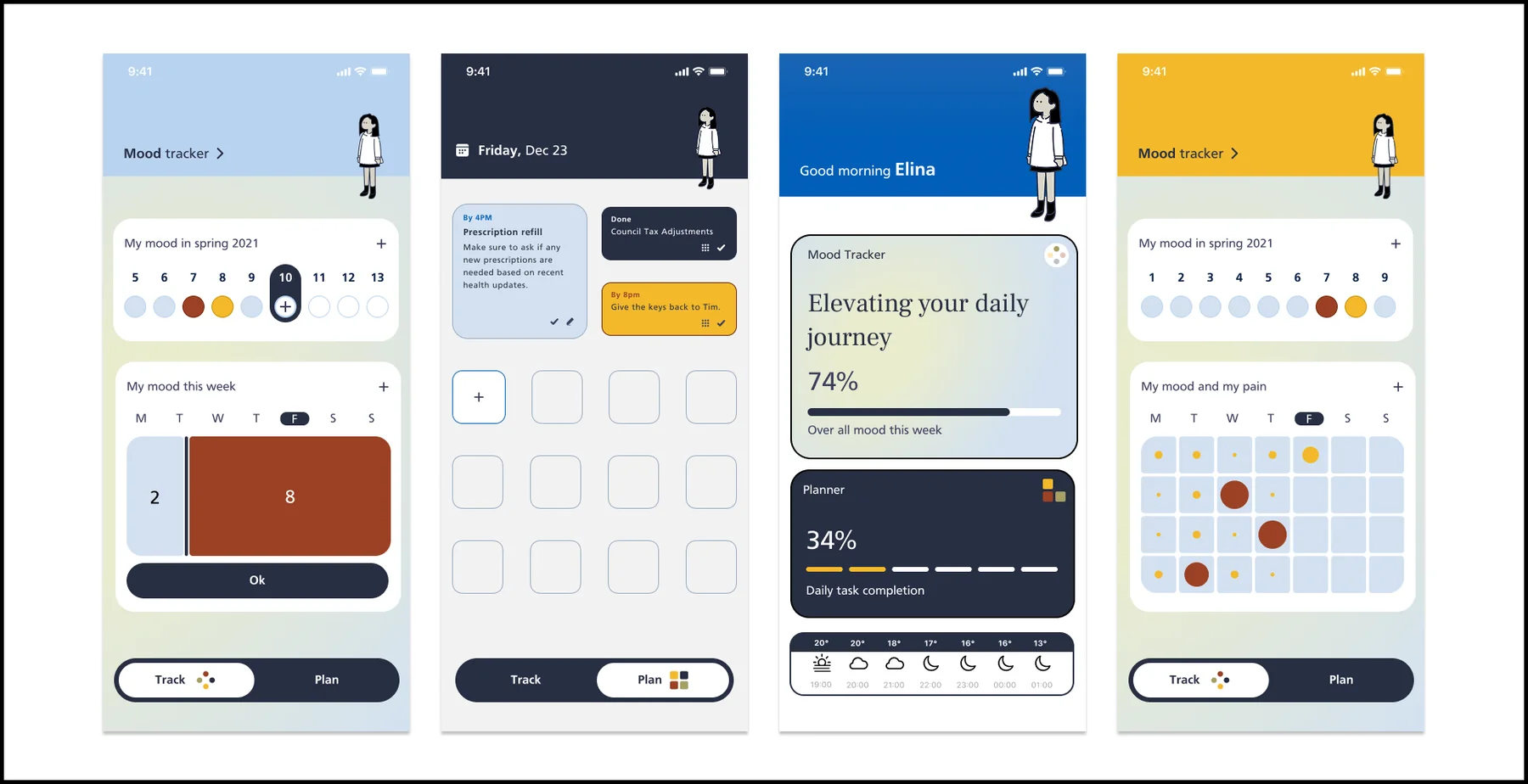
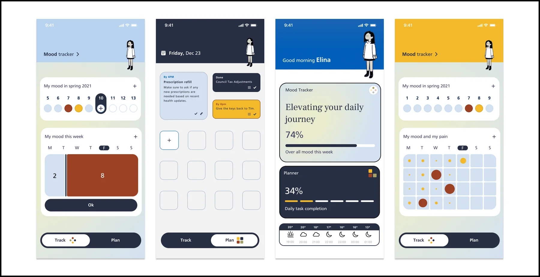
A child & adolescent mental-health team sees a teenager for an hour, then loses sight of them until the next appointment. This project built the two-sided service in between: a mood diary that is genuinely private for the teenager, and a dashboard that gives clinicians the right information at the right time — without adding workload.
One hour a week, then the teenager disappears
The team called it the Triangle of Care — and every corner of it was blind.
The answer wasn't one app but two connected ones: a mood diary a teenager would actually trust, and a clinician dashboard that surfaces what matters before the session — named, in the GDS habit of saying what a thing does, "Clinician Data Dashboard".
I asked all three corners before drawing anything
Two months of discovery, qualitative first, checked against numbers — then three co-design workshops: a half-day with 12 clinicians, two hours with 8 teens, and a feasibility session with the safety officer, digital governance and two developer leads.
The teens rejected the feature adults assumed they'd love
Everything from the workshops went through a value-versus-complexity matrix, with GDS #2 — do less — as the tie-breaker. Peer-to-peer messaging died in the bottom-right quadrant: the teens themselves killed it, on privacy grounds.
High impact · low complexity — kept
High impact · high complexity — deferred
Low impact · low complexity — parked
Low impact · high complexity — rejected
Privacy wasn't a checklist at the end — it shaped the product:
"My Mind Diary — your private space to share, only if you want." THE WAITING-ROOM POSTER LINE — PRIVACY AS THE PITCH, NOT THE FOOTNOTE
Private by default, shared only by choice
Try the shipped privacy model below — log a week, then decide, entry by entry, what your clinician sees.
The young person's diary
What the clinician sees
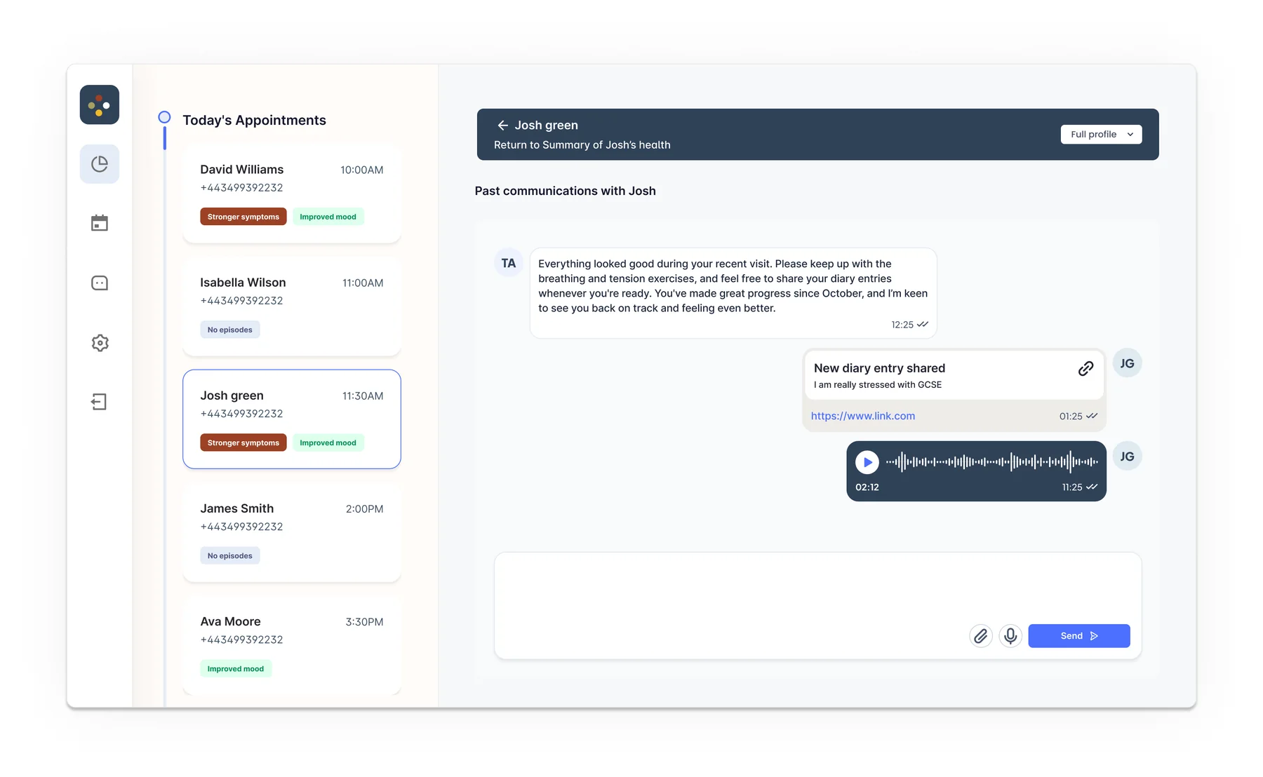
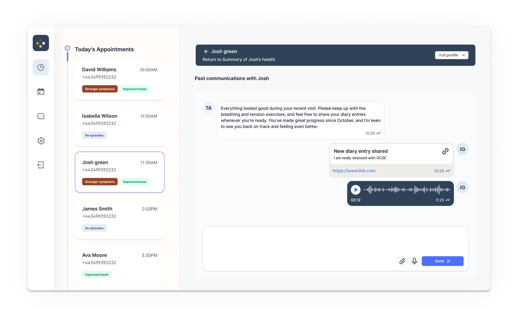
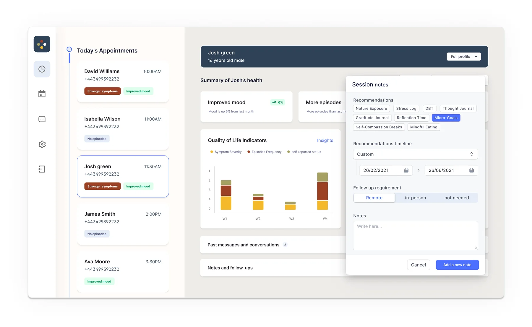
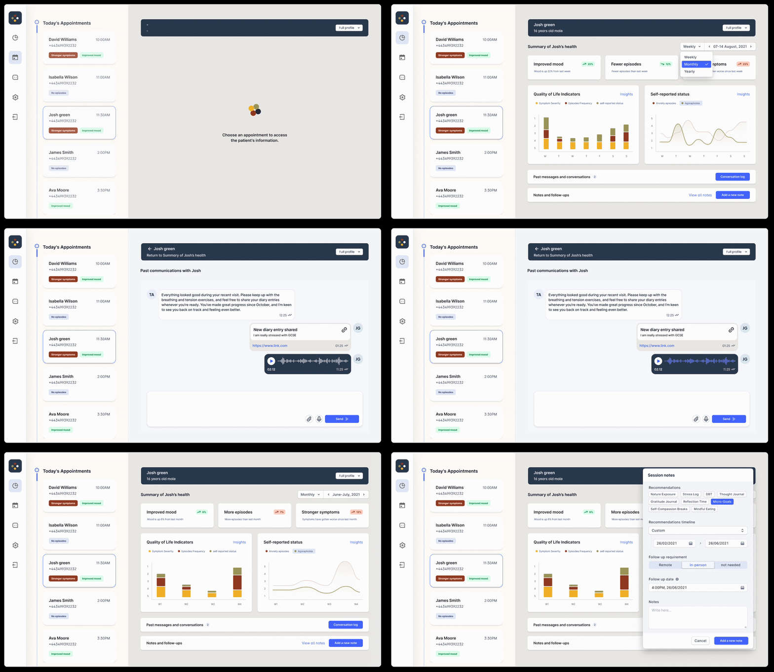
The clinician's side opens on today, not on a database: the day's appointments with change chips — "stronger symptoms", "improved mood", "no episodes" — a patient timeline of quality-of-life indicators, and the entries a patient chose to share, right in the communication thread where the conversation happens. Session notes end with recommendation chips (micro-goals, DBT, thought journal) and a follow-up booking, so the admin happens inside the clinical flow.
Tested mid-build, then run in a real clinic
Scenario-based sessions with 5 clinicians and 5 young patients changed the build where the evidence said: an entry-tagging system was added; a "your clinician read your entry" notification was postponed. QA ran on real iPhones and Androids.
The decisions that mattered were refusals
What I'd tell another designer taking this on: the product decisions that mattered most were refusals — no peer messaging, no notification theatre, nothing shared without an explicit choice. Trust was the feature. Everything else was UI.
Source notes
- Trust identity, staff and patient details anonymised throughout; personas in the full deck are labelled fictional.
- Research figures (interview counts, survey Ns, workshop rosters, beta cohort) are from the project's research plan and rollout deck, shown above.
- Full interactive case study: withcontexts.com/artifacts/safe-space