Case file 003 · NHS mental health trust · 2020 · discovery → live beta
Safe Space, NHS mental health care when it moved home
Shad Abbaslou · Product Design Lead · Hands-on across AI, Agents and Workflows
24 min read · 16 min skimmed · 40 slides

Case file 003 · NHS mental health trust · 2020 · discovery → live beta
In 2020 COVID sent an NHS trust’s mental health clinicians home, and the people they cared for were already there. Care that had happened across a desk had to happen through a screen, for the first time, at both ends of the age range. This built the connection in between: a diary private enough for a teenager to use, an app simple enough for someone making their first video call, and one clinician tool made for calls rather than rooms.
Outcome · up front
The decisions that mattered were refusals
How this is told
Two diamonds: the problem, then the answer
Each diamond opens wide and closes on one thing: the first on the problem worth solving, the second on the answer. It is the order this deck is told in, and every slide carries its phase at the top left; the case file keeps the order of the work.
- Two ends of one service, sent home at…
- The old system assumed / The new tool…
- Two ends of one service, sent home at…
- and 7 more
- Four jobs, one per person at the table
- The teens rejected the feature adults…
- The teenagers killed peer messaging…
- and 2 more
The brief, in three lines
- Whata private diary for teenagers, a summary for parents, a simple app for older adults, and one clinician tool for calls
- Foran NHS trust’s young people’s and older adults’ mental health teams
- ProblemCOVID sent clinicians and patients home, and the notes system was built for a room
ONE SERVICE, TWO ENDS OF IT
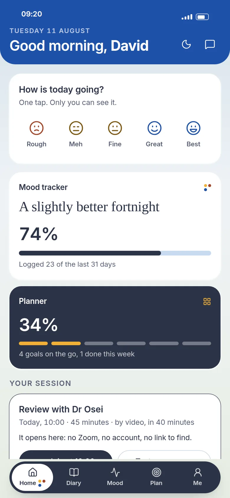
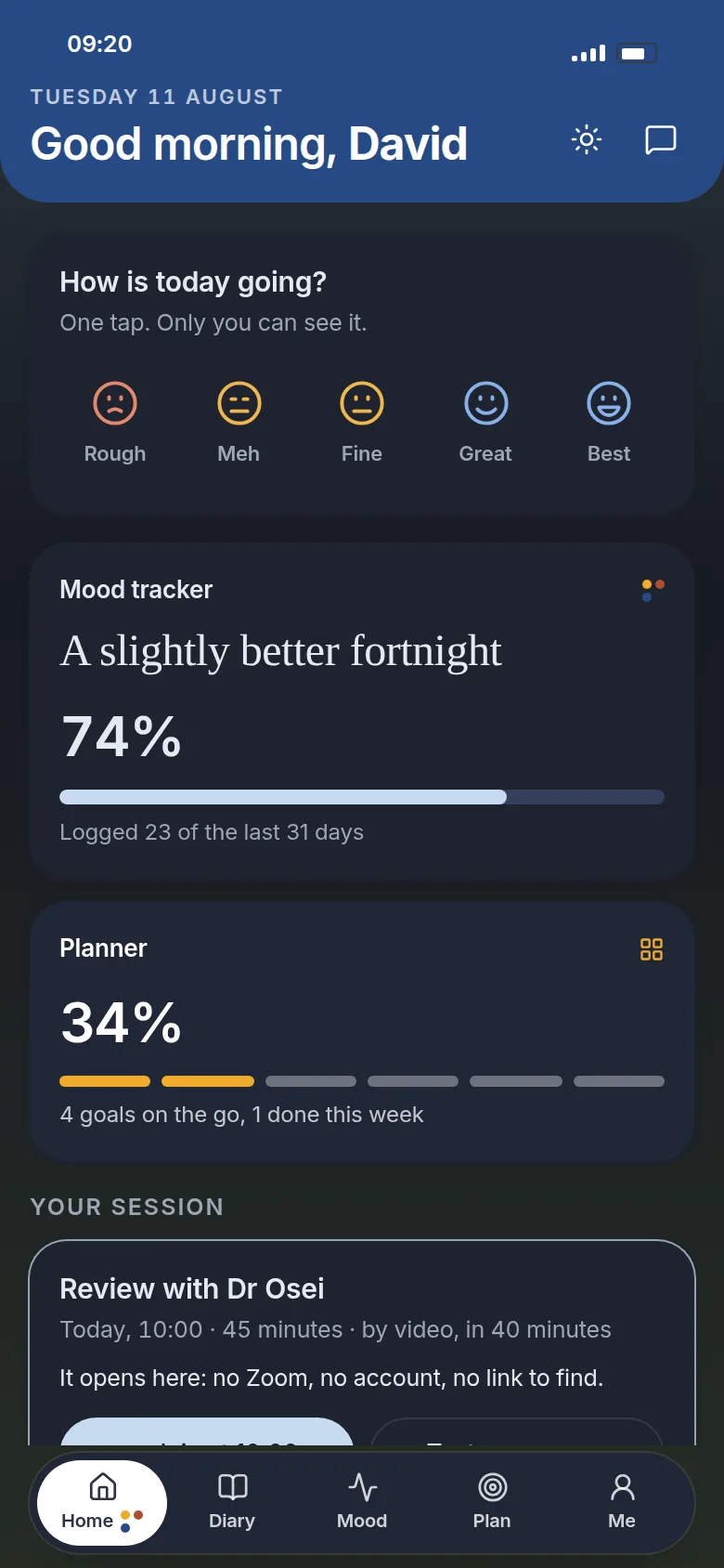
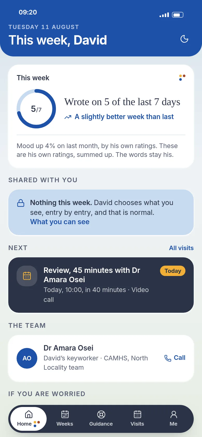
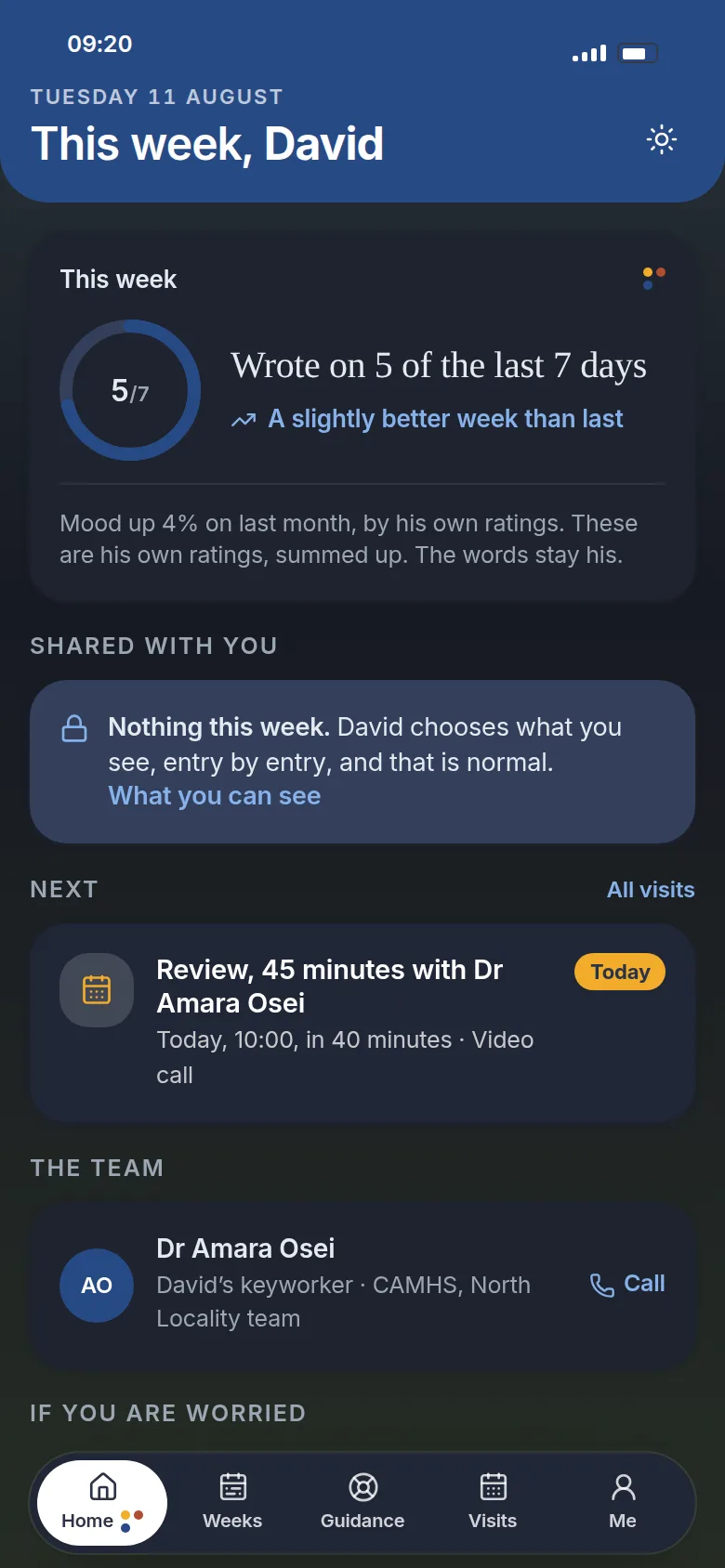
Phase 1 of 4 · widenDiscover
What was actually wrong, and for whom: the evidence before any answer.
When care went home
Two ends of one service, sent home at once
I came to the trust’s work through an agency, with access across its projects. The largest was this one. In 2020 COVID moved its mental health care out of clinics and into people’s homes, and the software it ran on was built for a room.

When care went home
There is no such contact type, a room is mandatory, a phone call is refused as administrative, and the history is a printout to an office nobody is in. This is the kind of system the clinicians had, rebuilt from memory to show the problem; it is not a copy of it.
When care went home
Two ends of one service, sent home at once
What the old system assumed, and what the new one does instead. Each line opens the tool at the place it does it.
| The old system assumed | The new tool does |
|---|---|
| A contact happens in a room, and a room is mandatory | A contact is a call, by video or by phone, and a room is the exception. Book one |
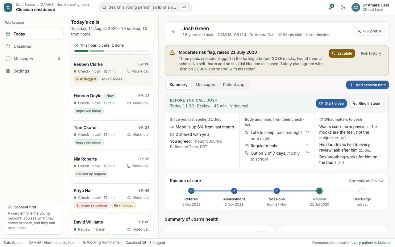
| One appointment at a time, in a building | Four or five calls an hour, with the hour on screen: how many, how many done, who is next. See the day |
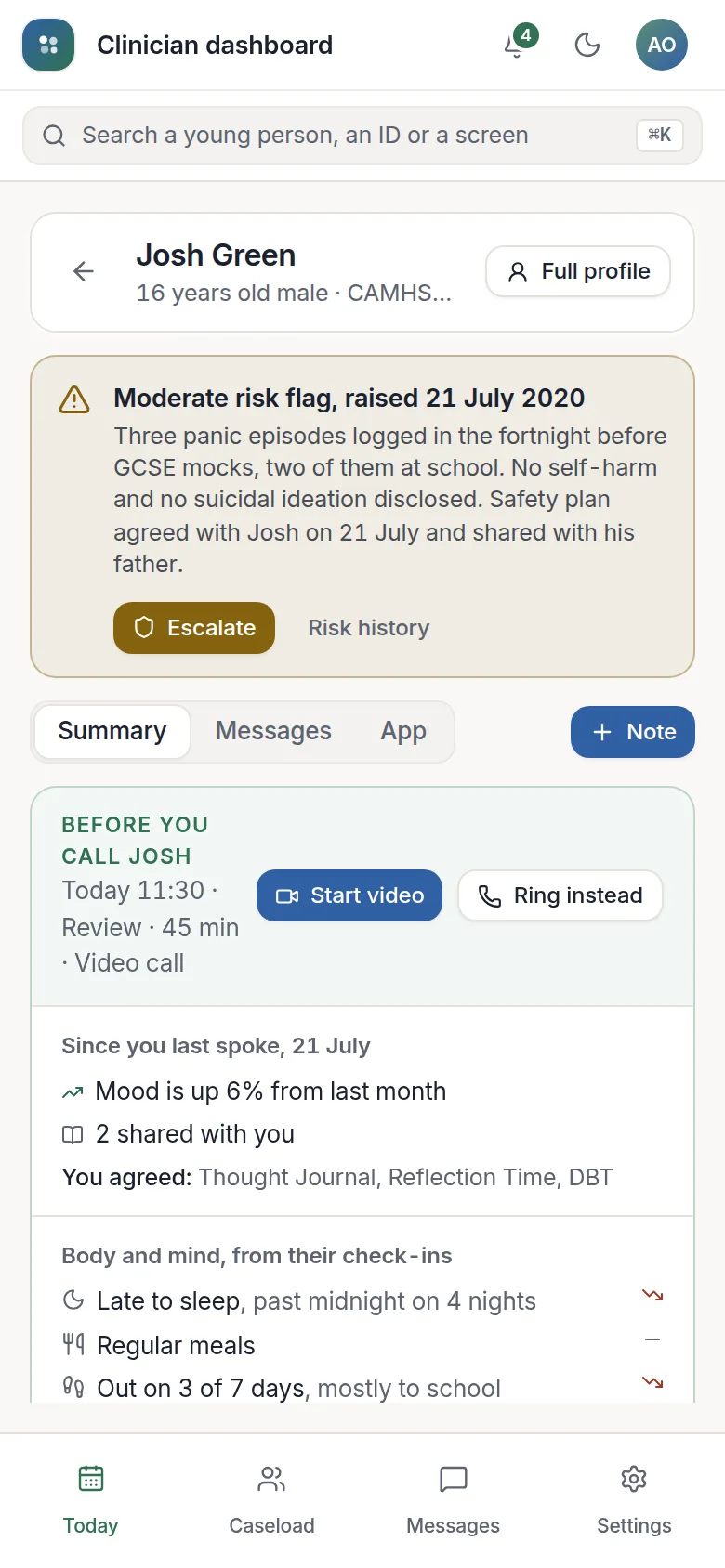
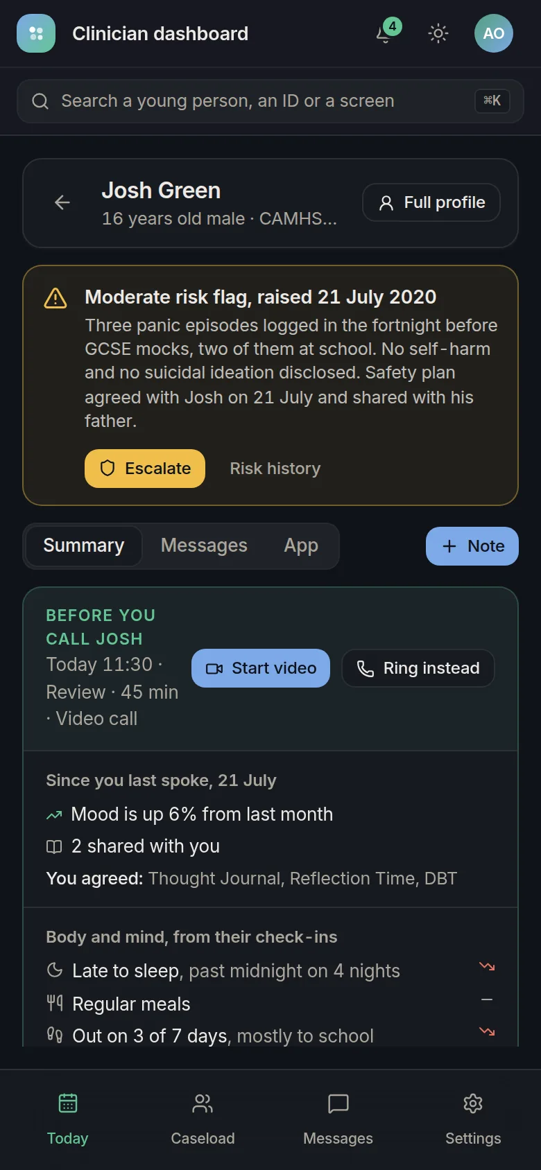
| The history is a printout | Each call opens on a brief: what has changed since you last spoke, what you agreed, what matters to them. Open Josh’s |
| A note is a free-text box for the record | A note keeps one thing to remember for next time, and the next call opens on it. Open Hannah’s |
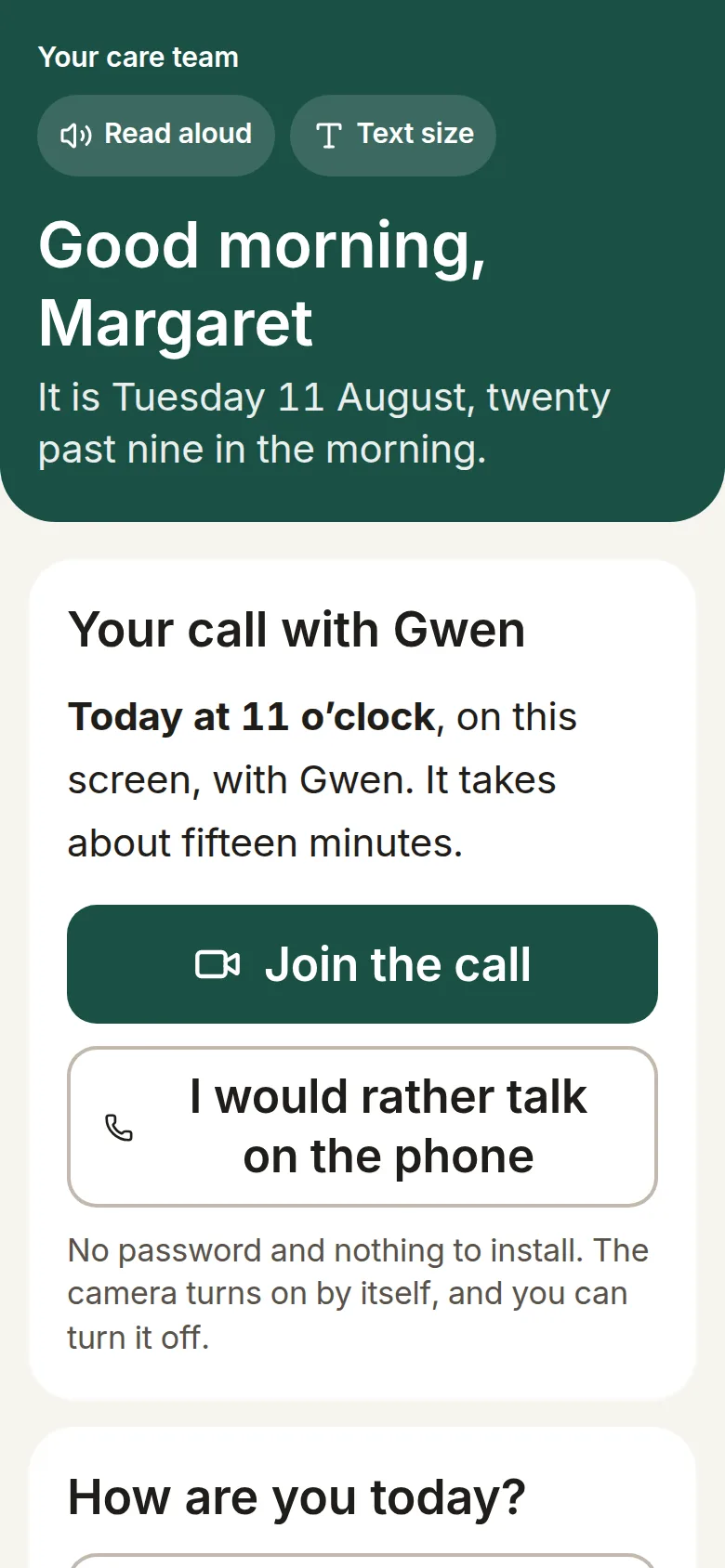
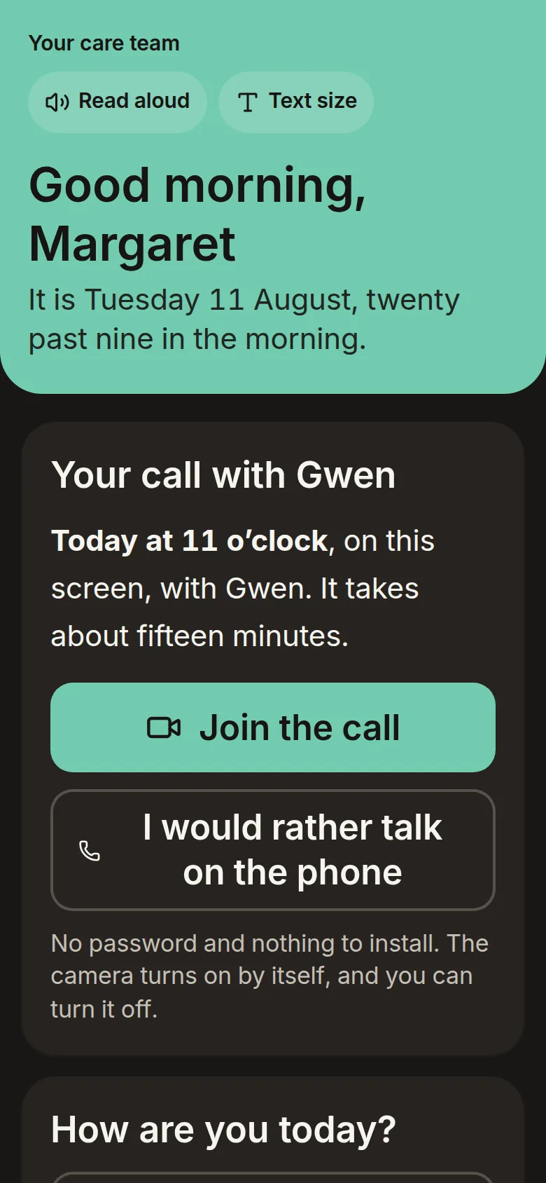
| Mood, if anything, typed up afterwards | The body beside the mood, from the person’s own check-ins: sleep, meals, getting out, pain. Open Margaret’s |
| One kind of patient, at a desk in an office | One tool for the young people’s team and the older adults’ team, on a laptop at a kitchen table or on a phone. Switch team |
The setup
One hour a fortnight, then the teenager disappears
The setup
The team called it the Triangle of Care, and every corner of it was blind.
Research · 19 sessions · 70 surveys · 3 workshops
I asked all three corners before drawing anything
Two months of discovery, qualitative first, checked against numbers, then three co-design workshops: a half-day with 12 clinicians, two hours with 8 teens, and a feasibility session with the safety officer, digital governance and two developer leads.
Research · 19 sessions · 70 surveys · 3 workshops
Research · 19 sessions · 70 surveys · 3 workshops
Both surveys, one scale
Run after the interviews, so the questions came from what people had already said. Each bar is the share who agreed. Three rows became the product’s shape, and the findings below open the product where each shows.
Clinicians in the trust N = 30
- I would use a digital dashboard if it saved me time100%
- Real-time patient-reported data would improve my care90%
- I struggle to track patient progress between sessions82%
- I currently rely on patient or parent recall73%
- I am concerned about information overload so the record opens on highlights45%
Young people and parents N = 40
- I worry about who can see what I write so it is private by default88%
- I would use an app if my clinician suggested it76%
- Having a way to express myself between sessions helps70%
- I am okay with my clinician seeing my entries64%
- I am okay with a parent seeing my app activity so parents get a summary, never the words34%
Research · 19 sessions · 70 surveys · 3 workshops
Six findings, and where each one lives now
88% of 40 worry about who can see what they write. “I don’t mind my therapist seeing my mood tracker, but I’d panic if my mum read my actual journal entries”, a 16-year-old.
Sharing per entry and per reader, the mood alone by defaultAll the young patients said it must not feel like homework or another clinical questionnaire, and that they would stop if it felt cold or like a form.
A diary that opens on today, not on a questionnaireA 17-year-old said it is sometimes easier to write down what they feel than to say it out loud.
Chat instead of talking, offered before every sessionMost would accept a summary rather than the entries, and pushing for detail is what ends the conversation. 34% of young people would let a parent see their activity; 80% of parents want to.
A weekly summary, never the words82% of 30 struggle to track progress between sessions; 73% rely on what the patient or a parent remembers.
The record opens on what changed since you last spokeThat is all the time clinicians said they had, and 45% of 30 feared information overload.
Highlights first, one chart, the rest foldedResearch · 19 sessions · 70 surveys · 3 workshops
The programme above is how the research ran. This is what it found, and it is the reason the product has the shape it has: two of the three relationships in the triangle are uncontested, and one is not.
Phase 2 of 4 · narrowDefine
The problem narrowed to the one worth solving, and the rules any answer had to keep.
The setup
Four jobs, one per person at the table
Written from the interviews, not quoted from them: what each person was trying to get done when the service went home.
- The young personWhen I have had a hard day and cannot say it out loud, I want to write it down privately, so I can choose later whether my clinician sees it.
- The parent or carerWhen I am worried about my child between appointments, I want to know how their week went without reading their diary, so I can help without breaking their trust.
- The clinicianWhen I have five minutes before the next call, I want to see what has changed since we last spoke, so the call starts where the last one ended.
- The older adultWhen the nurse is due to ring, I want one button that connects me, or a phone call if it will not, so I can talk to my nurse without learning a computer.
Decisions
The teens rejected the feature adults assumed they'd love
Everything from the workshops went through a value-versus-complexity matrix, with point 2 of the GDS Service Standard, do less, as the tie-breaker. Peer-to-peer messaging died in the bottom-right quadrant: the teens themselves killed it, on privacy grounds.
High impact · low complexity, kept
High impact · high complexity, deferred
Low impact · low complexity, parked
Low impact · high complexity, rejected
Decisions
The teenagers killed peer messaging, not the safeguarding team. I had it in the build. Every workshop said the same thing in a different way, and the feature that survives a room like that is the one you can defend two years later.
Decisions
Privacy wasn't a checklist at the end; it shaped the product.
"My Mind Diary, your private space to share, only if you want." THE WAITING-ROOM POSTER LINE, PRIVACY AS THE PITCH, NOT THE FOOTNOTE
Phase 3 of 4 · widenDevelop
The answer drawn, tried and argued over, including the parts that were thrown away.
Decisions
The design
Private by default, shared only by choice


The design
Private by default, shared only by choice

The design


The design
Where AI does not go
A position rather than a finding: nothing a young person writes is read, summarised or scored by a model, and the products say so where the data is set, in the diary and in the clinician’s settings.
- Why notThe research’s first finding was that privacy is everything to the young people, and 88% of them worried about who could see what they wrote. A model is one more reader, and the one they could not see.
- What it would takeNICE’s evidence standards ask a digital health tool for evidence in proportion to what it does, and a tool that shapes care asks for the most. The constraints this beta ran under were set by the trust’s clinical safety officer and digital governance; a model reading entries would go back through both before it was built.
- Where it might belongIf a model ever helped, the place it would have to earn is the clinician’s five minutes before a call, over what the young person has already chosen to share, and it would say it was a model wherever it spoke.
Testing & beta
Tested mid-build, then run in a real clinic
Scenario-based sessions with 5 clinicians and 5 young patients changed the build where the evidence said: an entry-tagging system was added; a "your clinician read your entry" notification was postponed. QA ran on real iPhones and Androids.
- 1 · WireflowsEvery key task in sequenceThe dashboard: log in, the patient list, a patient’s detail with charts. The app: consent, the daily mood, a journal entry, past entries, the sharing settings.
- 2 · ReviewToo many chartsReviewed in the team and with a few friendly stakeholders. The dashboard became one main chart and a few key metrics, after a clinician said: “just show me the highlights”.
- 3 · Mid-fidelityClickable, with real-looking dataFigma for the app, a web prototype for the dashboard, the trust’s components, and fictional records: Alex’s month of moods, a journal line about a rough day at school.
- 4 · UsabilityFive clinicians, five young patientsEntries gained tags and a mood scale that says which way it runs; the read notification was postponed.
- 5 · BetaA live clinic, three weeksThree clinicians, ten patients and eight parents, on the build the four passes left.
Testing & beta
Tested mid-build, then run in a real clinic
| Task | With | What it found |
|---|---|---|
| “Imagine you’re about to see patient Alex. Use the dashboard to get ready and tell us what you gather.” | 5 clinicians | 5 of 5 got ready from the dashboard and found the data useful 95% interval 51% to 100% |
| Reading the mood graph, labelled “Wellbeing Score over 4 weeks” | 5 clinicians | 2 of 5 could not tell whether higher was better 95% interval 12% to 77% Relabelled Mood (1 = low, 10 = high), and the rebuild gives every measure on the record’s chart its direction |
| “You’ve just had a hard day. Can you log that in the app? Now imagine a week passed, can you see how you were feeling over the week?” | 5 young patients | Fed the two changes the sessions made: entries gained tags, and the “your clinician read your entry” notification was postponed |
Phase 4 of 4 · narrowDeliver
What shipped, what each change moved, and what I would do differently.
Testing & beta

What was broken · what changed · 01 of 06
A CAMHS team sees a teenager for one hour, then loses sight of them until the next appointment, so clinical decisions were made on a fifty-minute snapshot of a fortnight.
Two connected apps rather than one: a mood diary with an optional prompt, and a dashboard that opens on today's appointments with change chips, a quality-of-life timeline and the entries a patient chose to share.
21people used it as part of real care: 3 clinicians, 10 patients and 8 parents, with the rollout metrics agreed before rollout.BETA · 1 CLINIC · 3 WEEKS
What was broken · what changed · 02 of 06
Teenagers will not volunteer how the week really went, and anything that reports on them quietly makes them report less.
Private by default, shared entry by entry. Nothing syncs on a schedule and nothing leaves the diary without the young person choosing it; the consent gate is the product, not a setting inside it.
Privacy became the pitch rather than the footnote: the waiting-room poster led with “your private space to share, only if you want”.THE POSTER LINE, VERBATIM
What was broken · what changed · 04 of 06
The mood graph was labelled “Wellbeing Score over 4 weeks”, and two clinicians could not tell whether a higher number meant a better week or a worse one.
Renamed it in plain language as “Mood (1 = low, 10 = high)”, in the GDS habit of saying what a thing does, which is also why the dashboard is called the Clinician Data Dashboard.
5 of 5clinicians then navigated the prototype successfully, naming the timeline graph and the alert flag as the parts they would use.CLINICIAN PILOT
Outcome
The decisions that mattered were refusals
| It worked if | Result | Status |
|---|---|---|
| It is used as part of real care | 21 people, three clinicians, ten patients and eight parents, at one clinic for about three weeks, with every approval in place | Met |
| The people using it want to keep it | 94% of beta users said the service should continue; the beta report gives the share, not the number it is a share of | Met |
| Teenagers write without being nudged | 4 entries a week per patient, in a product with no streaks and no escalating reminders | Met |
| Parents read the summary | 8 of 8 parents opened every weekly summary | Met |
| Clinicians can find what they need | 5 of 5 clinicians navigated the prototype | Met |
Outcome
What I would do differently
What I'd tell another designer taking this on: the product decisions that mattered most were refusals, no peer messaging, no notification theatre, nothing shared without an explicit choice. Trust was the feature. Everything else was UI.
- Test the riskiest assumption before it reaches the build. Peer messaging was in the build when the teenagers killed it. A paper version in front of them would have cost an afternoon.
- Keep the research records with the work. The breakdown behind the nineteen interview sessions survives only in this portfolio’s own earlier text, which makes it the weakest figure on the site.
USE IT, DON’T READ ABOUT IT
The finished product, running
Case file 003 · NHS mental health trust · 2020 · discovery → live beta
Questions
The decisions that mattered were refusals
The other decks001 · OI·DS002 · Astrato004 · Novo Nordisk005 · JBS