Three corners, and no shared interest
A teenager, a parent and a clinician are not three users of one product. They are three parties whose needs genuinely conflict, and almost every feature that serves one of them can betray another. This is the deck, with the research that proved it left in.
Weeks logged, weeks shared the gap between them is the product. Scrub it.
A CAMHS service, and a name chosen by rule
The client was a Child and Adolescent Mental Health Services trust working with teenagers living with anxiety and depression. The programme ran to the GDS Service Standard, which decided more than the process: it decided the name.
The name is a small thing that tells you what kind of programme this was. "Clinician Data Dashboard" is not a product name anybody enjoys writing. GDS guidance says a service should say what it does, so the thing that shows clinicians data is called the thing that shows clinicians data, and nobody had to learn a metaphor to find it.
Three points, one fragile network
The Triangle of Care is an existing model in adolescent mental health: patient, parent or carer, clinician. Reading it as a design brief, every edge is a communication channel that can build trust or quietly destroy it, and no edge carries the same traffic in both directions.
Read this plate as text
The Triangle of Care with its edges weighted by what the survey found. Between the teenager and the clinician, a solid edge: sixty-four per cent of young people are comfortable with a clinician reading their mood tracker. Between the teenager and the parent, a broken edge: thirty-four per cent. And eighty per cent of parents want that second edge open. The edge with the least consent is the one under the most pressure, which is the problem the product exists to hold.
Three months, four research methods, written down before any of it started
Discovery was planned as a programme and shown to stakeholders as one, with overlapping phases and a date where alpha begins whether or not the research feels finished. That plan is the reason the work was taken seriously by people who had seen design engagements arrive without one.
Read this plate as text
The discovery and alpha programme as it was presented to stakeholders before any of it was run. Eight overlapping workstreams across three months: stakeholder alignment and assumption mapping, personas and mapping, nineteen qualitative sessions with twelve people, seventy survey responses, stakeholder and co-creation workshops, prototyping and testing, usability testing, and iteration into beta preparation. The third month is shaded because that is where alpha begins whether or not the research feels finished, which is the commitment that made the plan worth showing.
Twelve people, three different scripts
Semi-structured interviews, forty-five minutes to an hour, with teenagers, their parents or carers, and clinicians. Three separate question sets, because the three corners do not share a problem and asking them the same questions would have produced a false consensus.
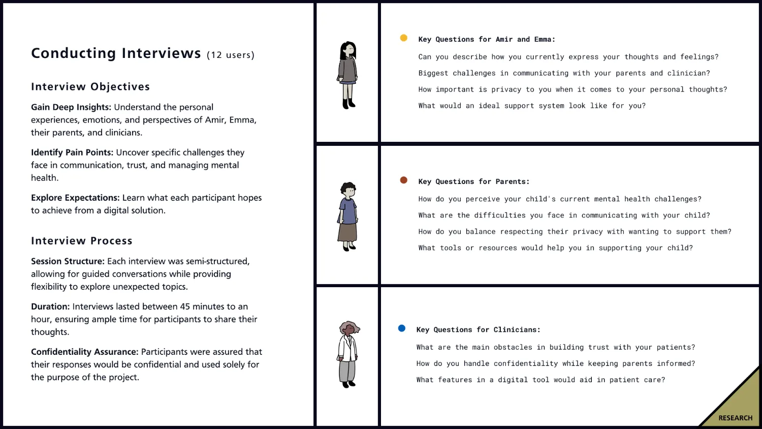
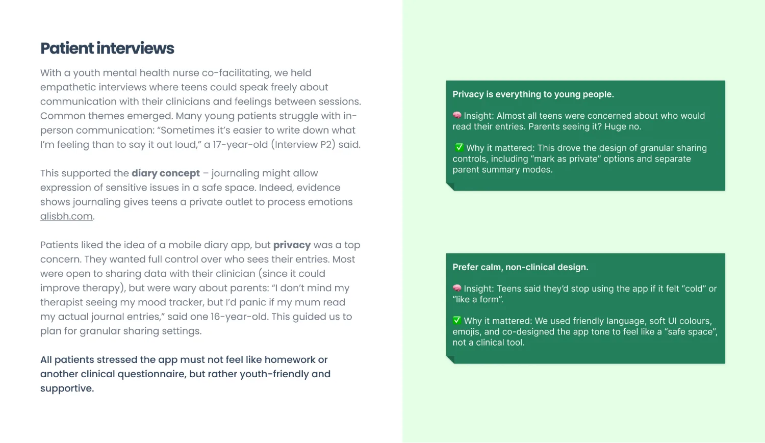
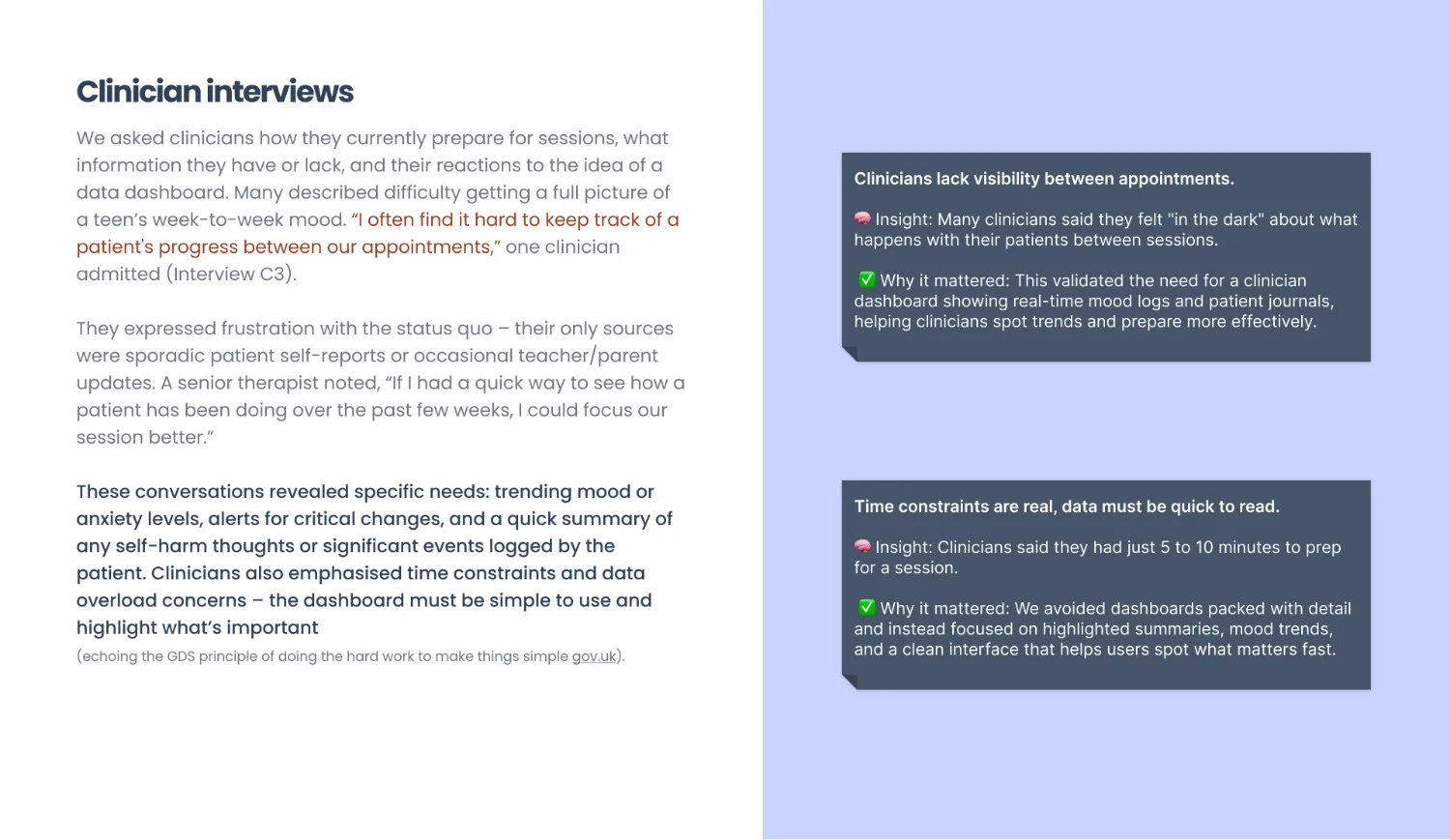
"I don't mind my therapist seeing my mood tracker, but I'd panic if my mum read my actual journal entries" INTERVIEW · A SIXTEEN-YEAR-OLD
That sentence is the product. Not the diary, not the dashboard: the fact that one person can be safe to tell and another cannot, that the difference has nothing to do with how much either of them loves the teenager, and that no existing tool in the service let anybody express it.
64% would let a clinician look. 34% would let a parent.
Two surveys were run after the interviews rather than before, so the questions came from things people had already said. Thirty clinicians in the trust, and forty adolescents and parents combined, collected anonymously with parental consent. The gap they found is the one number this entire programme turns on.
Read this plate as text
Both surveys drawn against the same scale so the two sides can be read against each other. Among thirty clinicians: every one of them would use a dashboard that saved time, ninety per cent say real-time patient data would improve their care, eighty-two per cent struggle to track progress between sessions, seventy-three per cent rely on recall, and forty-five per cent are afraid of information overload. Among forty adolescents and parents: eighty-eight per cent worry about who reads what they write, seventy-six per cent would use an app a clinician suggested, seventy per cent want a way to express themselves between sessions, sixty-four per cent accept a clinician reading their entries, and thirty-four per cent accept a parent seeing their activity. The two marked rows are the constraint and the refusal the product was built around.
Read those four together and the brief writes itself. The clinicians unanimously want the tool, and nearly half of them are afraid of what it will do to their inbox, so it has to distil rather than dump. The teenagers will use it if a clinician suggests it, and almost nine in ten are frightened of being read, so privacy cannot be a setting buried in a menu. And the parents want twice the visibility their children are willing to give, which means somebody has to be told no, in an interface, gently, forever.
65% of serious incidents or relapses in the past year had warning signs that could have been captured if a tracking tool was in place HISTORICAL CLINIC DATA · THE LINE THAT FUNDED THE PROGRAMME
Four questions, and one of them has no clean answer
Discovery closed with four research questions rather than a solution. Writing them down this way is a GDS habit and a good one: it forces the team to agree on what is still unknown before anybody starts drawing, and it makes the later refusals defensible.
Read this plate as text
The four research questions discovery closed on, each joined to the thing that answered it. A tool that respects a teenager’s privacy and still gets help to the people who need it was answered by making the diary private by default, so nothing leaves it on its own. Features that let a teenager manage their own care between appointments were answered by the journal and the mood track, built deliberately with no streaks and no notification theatre. An app that adapts to individual preference was answered by setting sharing per entry rather than per account, so consent is a decision taken each time rather than once. The third question, better communication across the Triangle of Care without compromising anybody’s trust, has its connector drawn and then cut, because it has no clean answer: there are forty-six points between what a teenager will permit and what a parent wants, and no feature closes that. The product chose a side and said so.
The third one is the hard one, and it is phrased honestly: improve communication without compromising trust. Most products in this space quietly resolve that tension by deciding the parent is the customer. We decided the teenager was, and then had to design the parent an experience that was genuinely useful anyway, which is harder and is most of the work in section eight.
Three rooms, and the third one had the governance lead in it
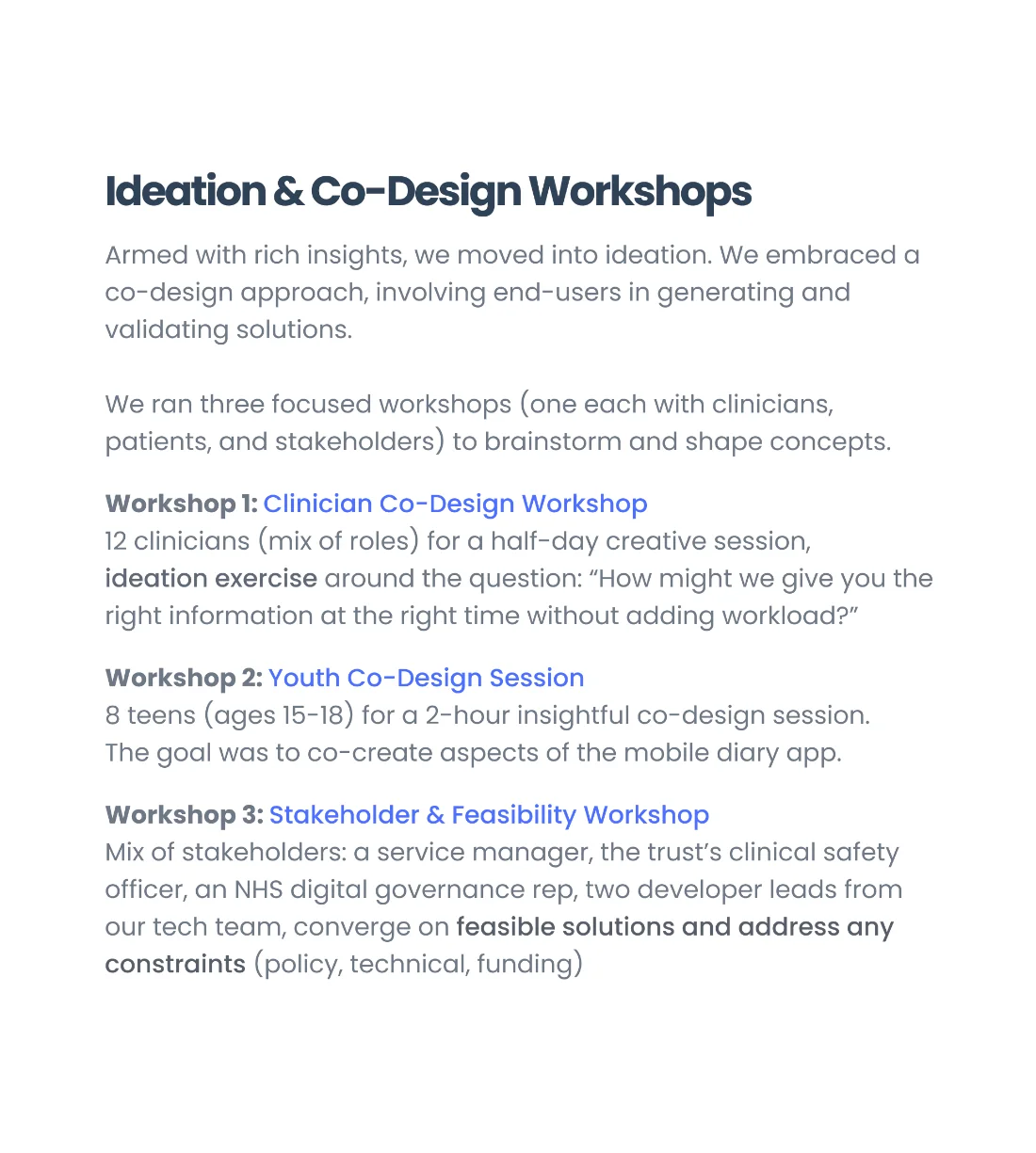
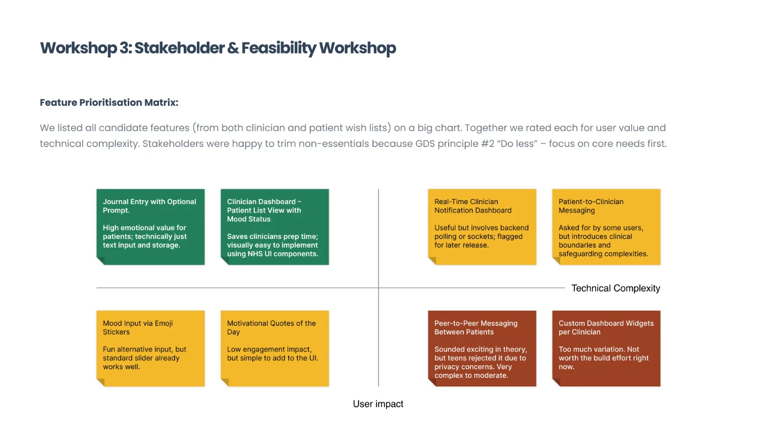
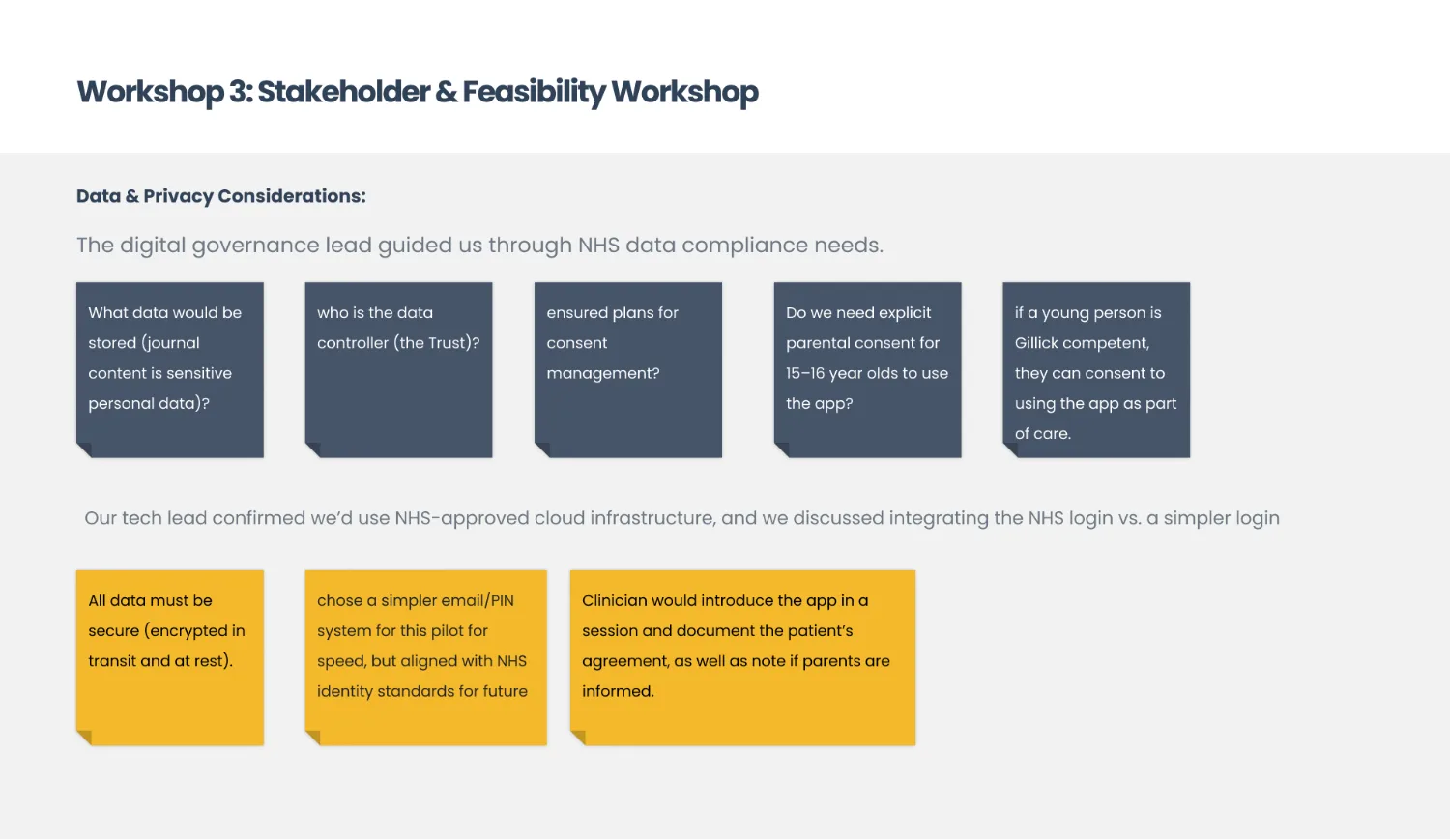
Co-design ran as three separate sessions rather than one mixed workshop, for the same reason the interviews used three scripts. Then a feasibility session with the people who could stop it: the service manager, the trust's clinical safety officer, an NHS digital governance representative and two developer leads.
Private by default. Shared only by a decision.
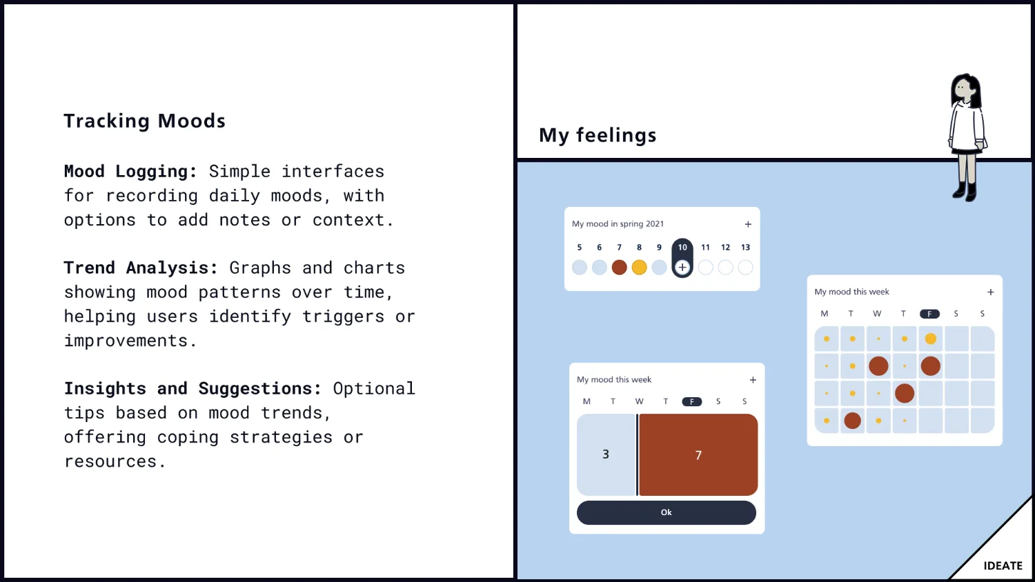
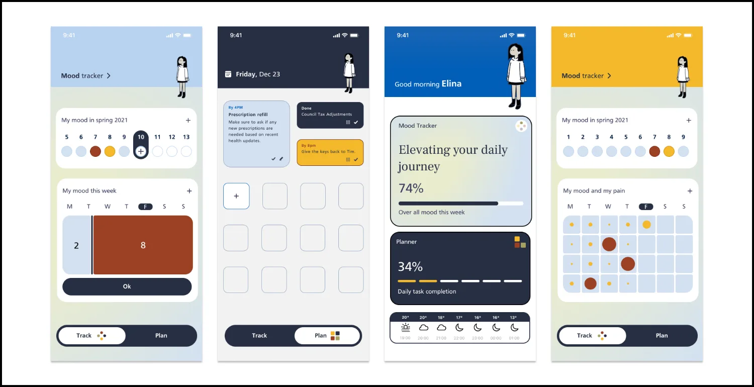
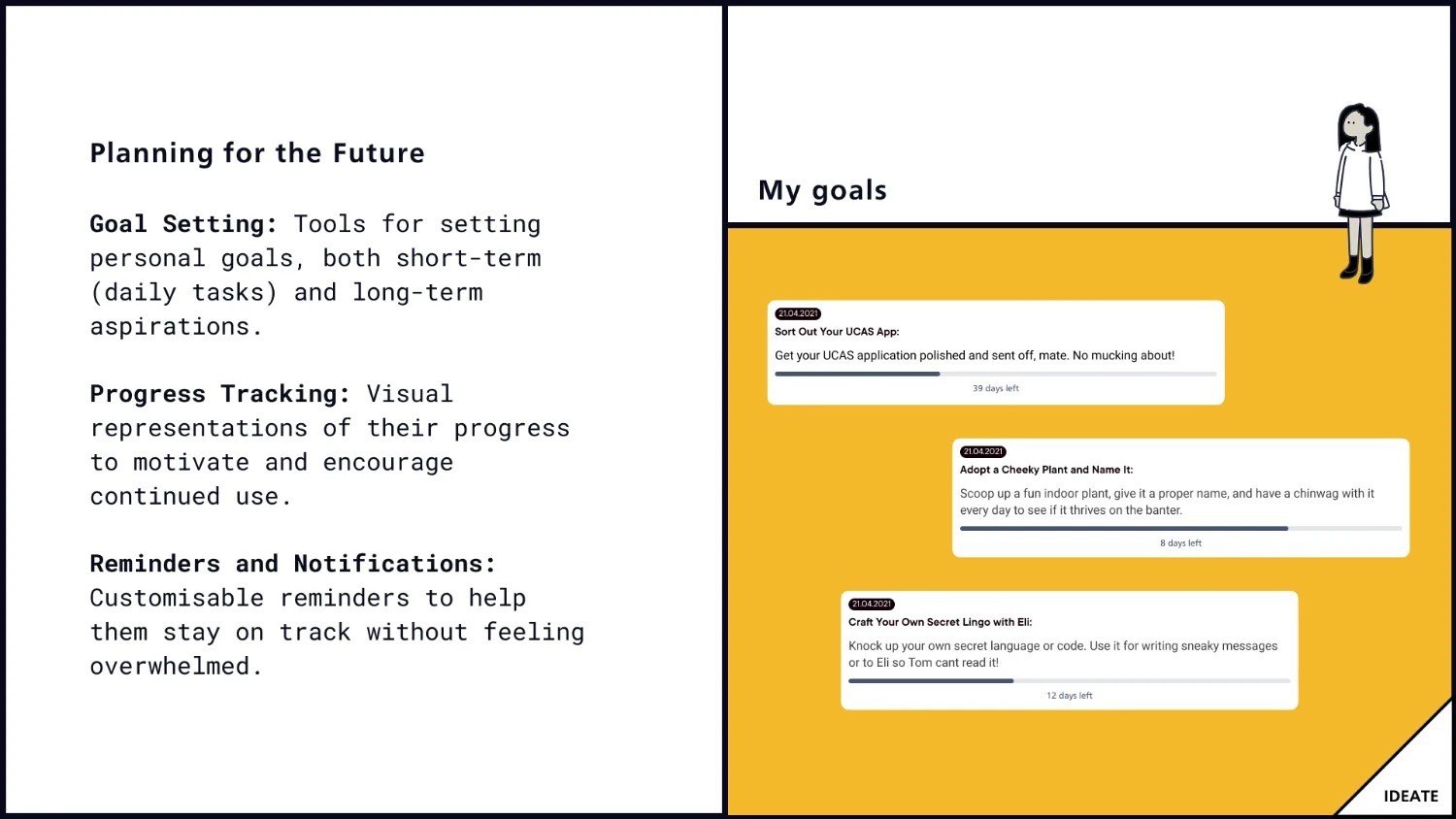
The product is three things a teenager can do alone, and one door they control. Logging a mood, setting a goal, writing an entry: none of it leaves the phone. Sharing is a separate, deliberate act, per item, with a named person, and it can be taken back.
Read this plate as text
The sharing model as a boundary. On the private side, everything a teenager can do alone: the mood log, the goals, the written entries, none of which leave the phone. On the shared side, what a parent or clinician can be given: a summary of how the week went without the sentences that made it hard, a trend a clinician can read in five minutes, and an alert flag on an entry the patient chose to share. Between them one gate, a request asked by a named person, visible to the teenager and declinable without a confrontation. Struck through below, the three things the product refused to build: peer messaging, streaks and nudges, and anything shared by default.
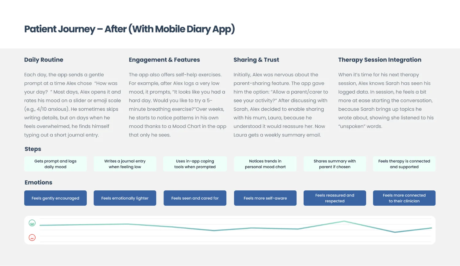
The decline mechanism is the part I would defend hardest. A teenager saying no to their mother in person is a scene; a teenager leaving a request unanswered in an app is a boundary. Moving that conversation into software was not a convenience, it was the entire therapeutic function of the feature, and it is the reason "share requests" exists at all instead of a simple on and off switch.
Five minutes to prepare, so five minutes is the design constraint
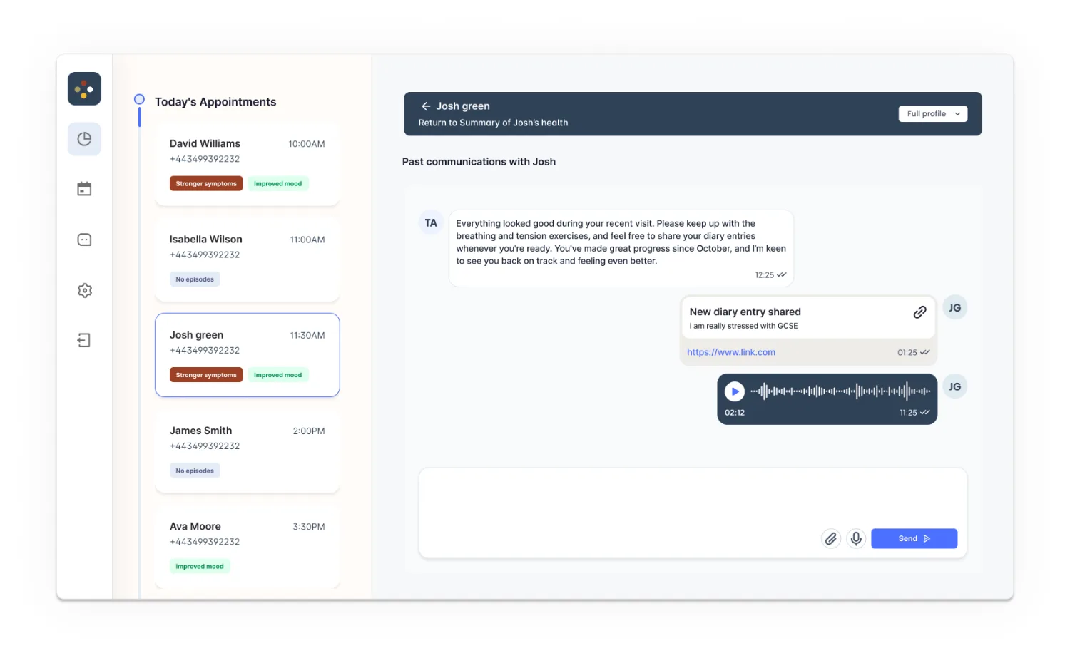
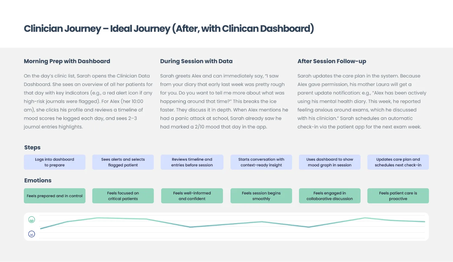
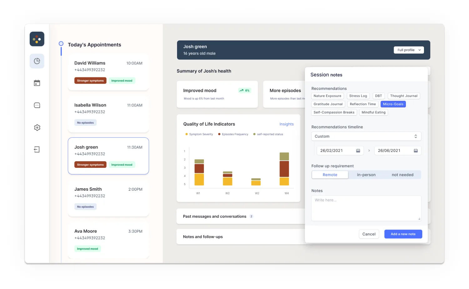
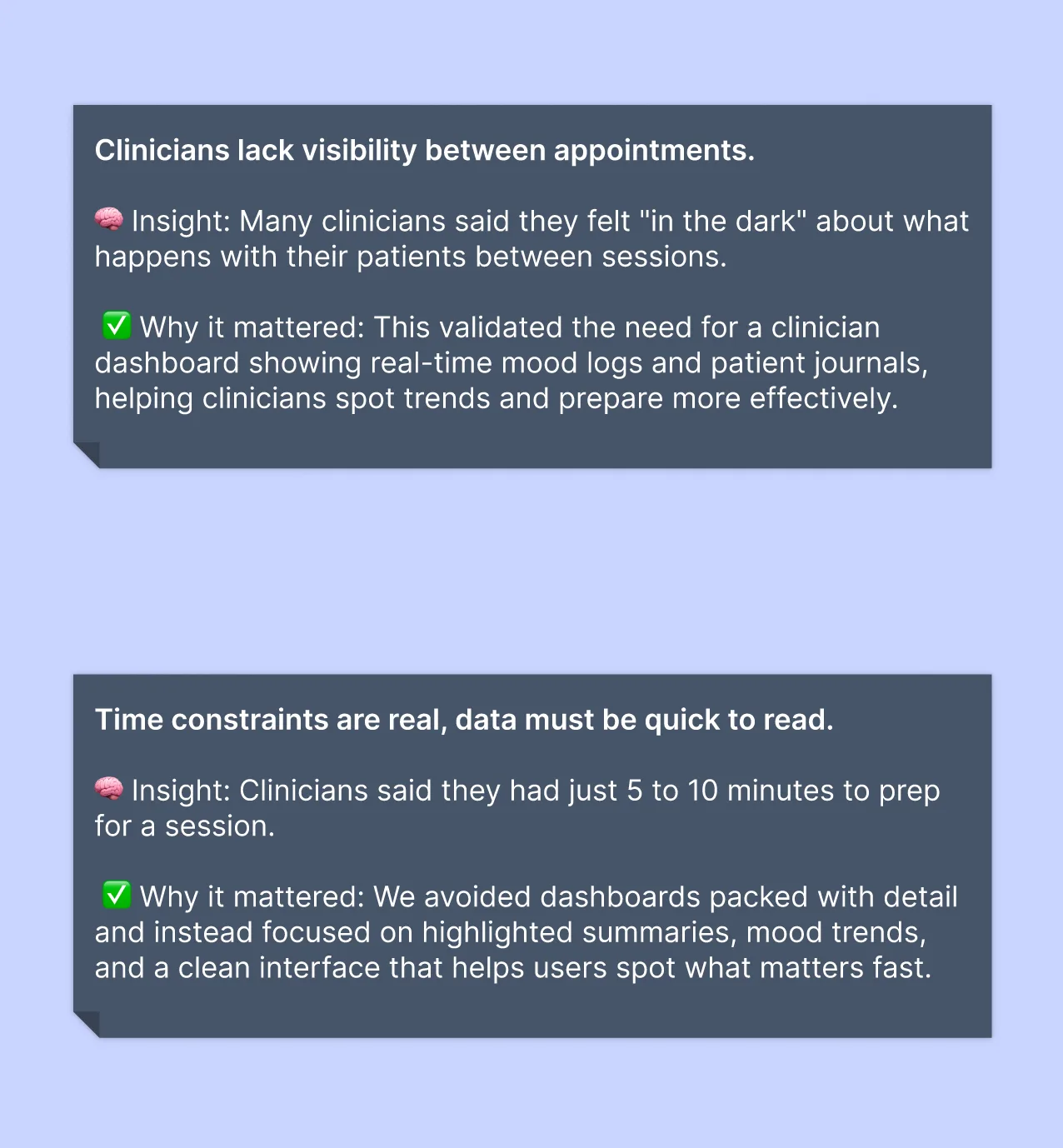
Clinicians told us they get five to ten minutes before a session. That single number did more to shape the dashboard than any amount of discussion about information architecture: it rules out exploration, it rules out dense tables, and it means the screen has to have already decided what matters.
Tested mid-build, then run in a real clinic
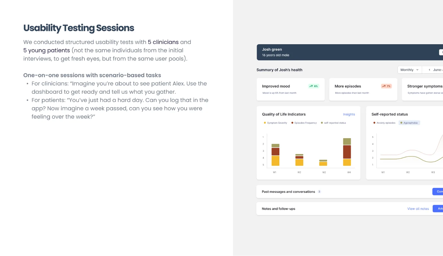
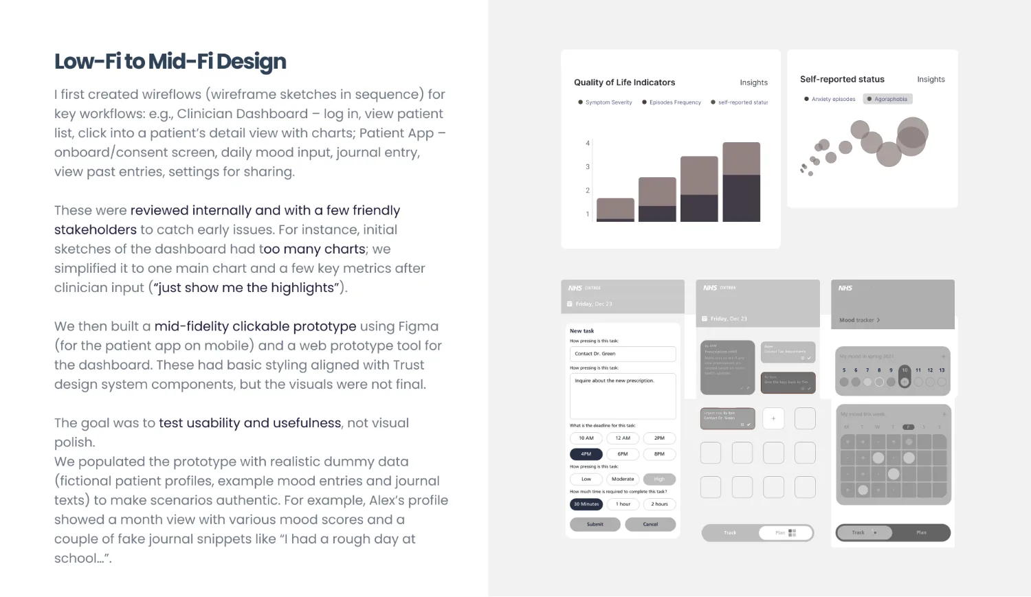
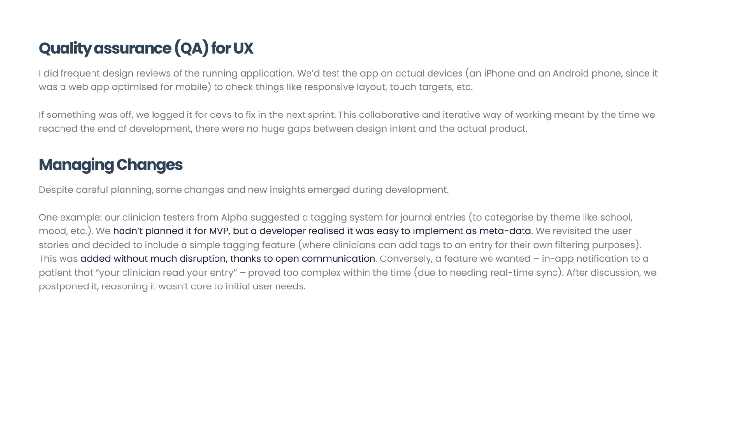
Usability testing ran against the prototype during alpha, then the system went into a live beta inside one service: three clinicians, ten patients and eight parents at one clinic site, with every approval in place, for about three weeks. Twenty-one people using it as part of care rather than as an exercise.
Read this plate as text
The live beta, counted. Three clinicians, ten patients and eight parents at one clinic site with every approval in place, for about three weeks, using the system as part of care rather than as an exercise. All eight parents opened every weekly summary. Ninety-four per cent of the beta users said the system should continue to be used.
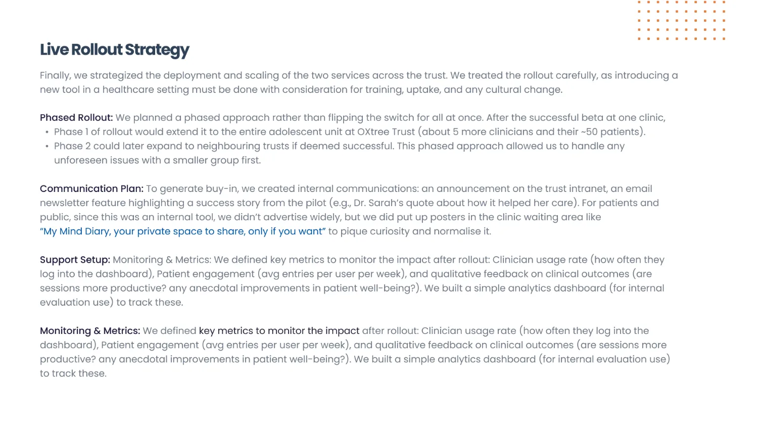
A rollout strategy in a design deck is unusual and it should not be. A product in a clinical service does not go live because it is finished; it goes live because somebody has planned the training, the comms to families, the support cover for the fortnight everyone is confused, and the measurements that will say whether to continue. Designing the thing and leaving that to somebody else is how good products die in month two.
Four calls, three of them refusals
On most products the decisions worth recording are things you built. On this one they are mostly things we were asked for and did not build, which is why the record matters more than usual.
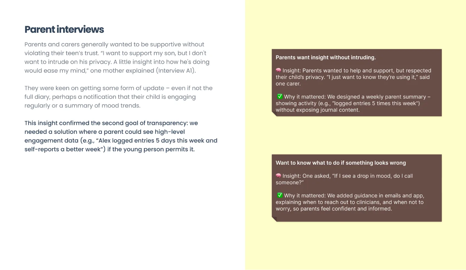
The commissioning assumption was a parent-facing product with a child-facing data source. The survey said thirty-four per cent against eighty per cent, and the position changed to match the evidence.
What it cost Telling the people paying for the work that the product they described would be deleted by the teenagers it was aimed at. The data made that sayable; without it, it is just a designer's opinion about somebody else's family.
Messaging between young people in the service was requested more than once, in good faith, as a way of reducing isolation.
Why An unmoderated channel between vulnerable adolescents is a safeguarding incident waiting for a date. The clinical safety officer agreed in the room, which is the only reason this did not come back every quarter.
Engagement mechanics were on the table. Daily streaks, reminder escalation, the usual apparatus for making a habit stick.
What it cost Measurable engagement, which is the number a product board most likes to see go up. Patients had said plainly that the app must not feel like homework, and a streak is homework with a scoreboard.
"Wellbeing Score over 4 weeks" became "Mood (1 = low, 10 = high)" after two clinicians in the pilot could not tell which direction was good.
Why It is recorded here because it is small and it is the kind of thing that gets quietly fixed and never mentioned. Two people out of five not understanding the central chart is a failure rate of forty per cent on the one thing the dashboard exists to show.
Whose trust the product could not survive losing
What I would tell another designer taking this on: in a service with three parties, your job is not to find the feature that makes everybody happy, because there isn't one. It is to work out whose trust the product cannot survive losing, say so out loud, and then design the other two an experience that is honest about its limits rather than quietly generous with somebody else's privacy.
Trust was the feature. Everything else on this page is interface.
The case file carries the argument and the working clinician dashboard. Read case file 003, or use the rebuilt dashboard.